
Response Surface Methodology Results
Response Surface Results
After completing the process of forming, we present the required response levels based on the appropriate model; the results related to the response(Response Surface Methodology) levels in different formats:
- Response points
- Min-max search
- Charts; Including:
- Two-dimensional standard, two-dimensional pieces, three-dimensional (2D, 2D slices, 3D)
- Local Sensitivity Bars / Pies Chart
- Local sensitivity activity curves
- Spider diagram
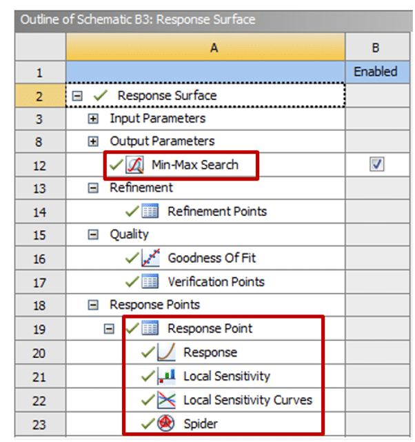
Figure 1 shows the sections presenting the final results of the response levels created in the ANSYS Workbench software.
Figure 1. Section providing results for response levels
Introduction of Response Points
At the end of the response surface production process, the response level estimates using the design points in the experimenter’s design, this level of creative response involves several points, each of these points on the response surface has values from each input parameter, thus, you can define the design point by defining the desired values for each parameter or input variable in their variation range. Created a new one other than the points generated in the test environment (DOE) and, as a result, obtained the desired output parameter value at this new point.
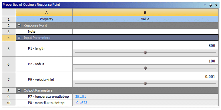
Suppose that in the example, the changes of the two output parameters as the output temperature (temperature-outlet) and the mass flow-outlet in terms of the changes of the three input parameters as the length geometry (length), radius geometry (radius) and velocity the flow inlet (velocity-inlet) investigates using the response surface methodology (RSM), the range of changes in geometric length is from 720 mm to 880 mm, and the range of changes in geometric radius is from 90 mm to 110 mm also, the range of changes in flow velocity is from 0.0009 m.s-1 to 0.0011 m.s-1, figure 2 shows the section for creating response points, which we can define by defining any desired value for each parameter of radius, length, and input speed. He obtains the output temperature value and the output current flow rate to produce a new design point and fit it.
Figure 2. section for creating response point
Introduction of Minimum and Maximum Search (Min-Max Search)
Automatically two types of optimization in terms of maximum and minimum values performs on each output parameter, a maximum value and a minimum value defines for each output parameter, these optimization steps are based on the response levels from the design points and will have reliable results, this process takes a short time, but if discrete and artificial values are defined manually for the input data or the number of output parameters is too large, it may take too long.
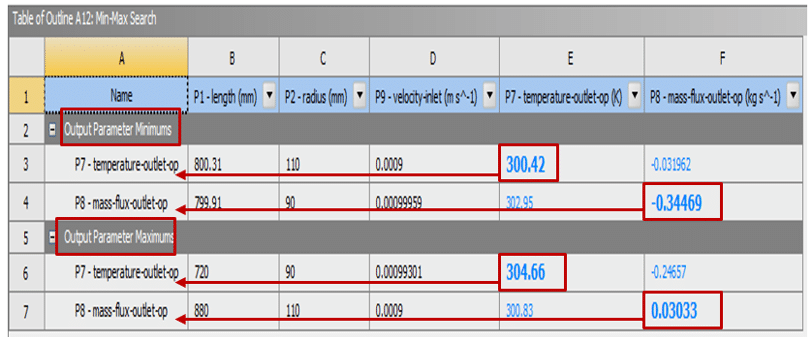
This section can provide the minimum and maximum of each defined output parameter, the two components, the minimum output parameter minimum, and the maximum output parameter maximum appear in tabular form; in this way, it determines for which values of the input parameters the output parameter reaches its maximum or minimum value, also, the maximum and minimum values obtains for each output parameter in a house whose rows and columns represent the same output parameter displays in color and large.
Suppose that in the example, the changes of the two output parameters as the output temperature (temperature-outlet) and the output flow (mass flux-outlet) in terms of the changes of the three input parameters as the length geometry (length), radius geometry (radius) and velocity The flow inlet (velocity-inlet) is investigated using the response surface methodology (RSM). Figure 3 shows the table for the maximum and minimum values obtained from each of the two variables of output temperature and output flow.
Figure 3. Table of maximum and minimum values of each output parameter
Introducing Standard 2D and 3D Charts (2D, 3D)
In the two-dimensional diagram, the chances of an output parameter shows in terms of the changes of an input parameter; Thus, the horizontal axis (x-axis) represents one of the selected input parameters or variables, and the vertical axis (y-axis) represents the changes of the desired output parameter. In the following three diagrams, the changes of one output parameter shows in terms of the changes of the two input parameters simultaneously; Thus, the two axes on the plane (x-axis, y-axis) represent two defined parameters or input variables, and the vertical axis (z-axis) describes the changes of the desired output parameter.
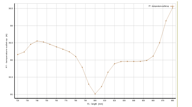
Also, in both two-dimensional and three-dimensional graphing modes, when the graph of changes in an output parameter plots in terms of one or two input parameters, the values for the other input parameters defined in the response level creation process (RSM) That do not uses in graphs must have a fixed value. So that this value can be from the minimum value of its change interval to its maximum value and can define manually. Suppose, in an example, the changes of an output parameter called the temperature-outlet are investigated in terms of the changes of an input parameter called the geometry length using the response level (RSM) method, also, other input parameters are equal to a constant value equal to their average value in the range of their changes. Figure 4 shows the outlet temperature changes in geometric length.
Figure 4. two-dimensional diagram of outlet temperature changes in turn of geometric length
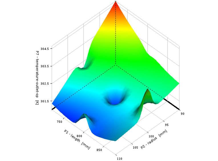
Now suppose that in an example, the changes of an output parameter called the temperature-outlet are examined in terms of the changes of the two input parameters called the length geometry and the radius using the response surface methodology (RSM), also, other input parameters are equal to a constant value equal to their average value in the range of their changes. Figure 5 shows the outlet temperature changes in length and geometric radius.
Figure 5. Diagram of outlet temperature changes in terms of length and geometric radius
Introduction of 2D Slices
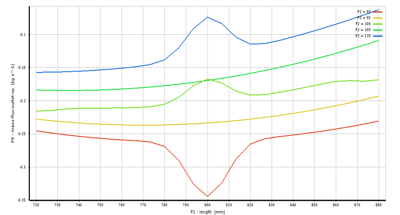
The changes of one output parameter show simultaneously according to the changes of two input parameters; Thus, a horizontal axis (x-axis) represents one of two defined parameters or input variables, a vertical axis (y-axis) represents changes in the desired output parameter and another input parameter as Pieces in a certain number of divisions places inside the chart. When drawing a two-dimensional diagram, the diagram of the changes of an output parameter draws according to one or two input parameters, the values related to other input parameters defined in the process of creating response levels (RSM) in Graphs do not uses; they must have a fixed value; So that this value can be from the minimum value of its change interval to its maximum value and defines manually.
Suppose, in an example, you can investigate the changes of an output parameter called the temperature-outlet in terms of the changes of the two input parameters called the length geometry (length) and the radius of the geometry (radius) using the response surface methodology (RSM), also, other input parameters are equal to a constant value equal to their average value in the range of their changes. Figure 6 shows the outlet temperature changes in length and geometric radius. The length parameter changes along the horizontal axis, and the radius parameter compares in pieces in five divided values.
Figure 6. Two-dimesional graph of outlet temperature changes in terms of length and geometric radius
Introducing Local Sensitivity Bar/Pie Charts
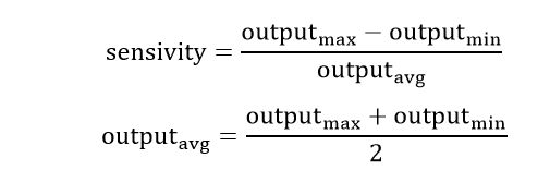
The local sensitivity bar/pie diagram determines the amount of change of each output parameter for each input parameter independently; this means how sensitive each output parameter is to each input parameter, the relation related to the sensitivity of each parameter or output variable is as follows; thus, this sensitivity percentage is equal to the ratio of the difference between the maximum value of the output parameter and its minimum value to the average value of that output parameter. If this criterion has a positive value, then the output parameter and the input parameter have a direct relationship. If this criterion has a negative value, then the output parameter and the input parameter have an inverse relationship. The higher the sensitivity, both positive and negative, and the higher the number one or 100%, the greater the dependence of the output parameter on that input parameter.
If you plot the local sensitivity diagram as a bar, the horizontal axis is the location of the measured parameter or output parameters; the vertical axis represents the sensitivity in percentage, and the colored bars in the representative diagram. Each of the input parameters is defined. If you plot the graph as a pie, a circle with a 360-degree angle will appear. Occupy more angles.
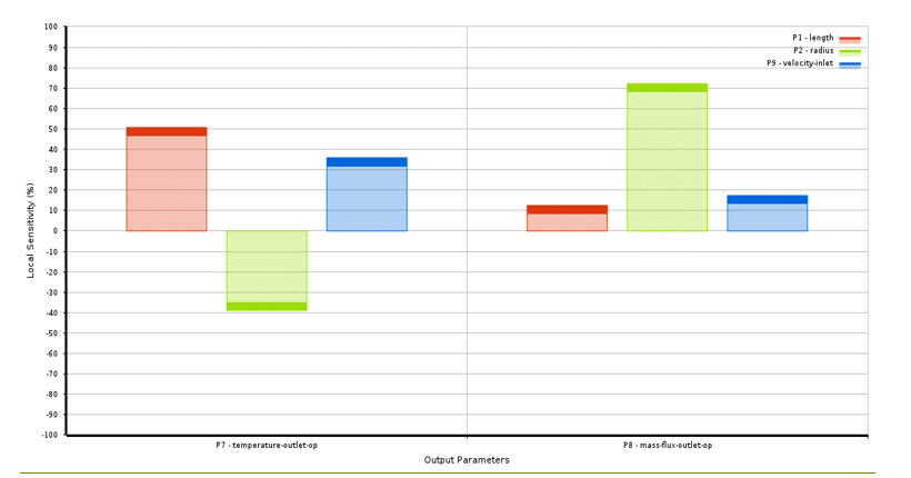
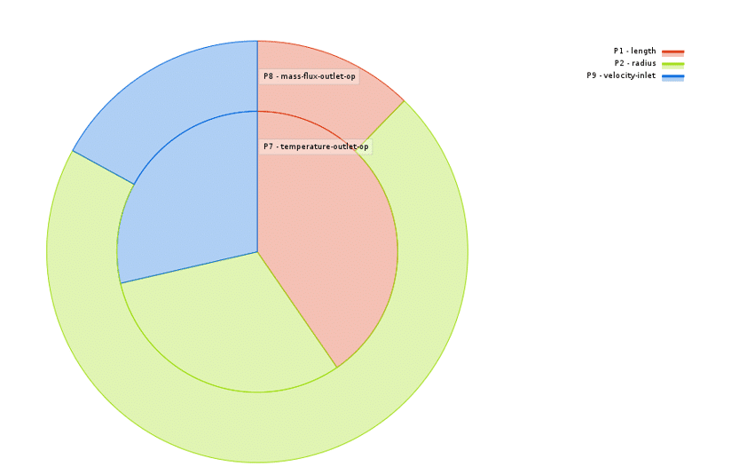
Suppose, in the example, the changes of the two output parameters as the outlet temperature and the mass flow outlet according to the changes of the three input parameters as the geometry length, the radius geometry, and the input speed of the flow (velocity-inlet) is investigated using the response surface methodology (RSM). Figure 7 shows the local sensitivity diagram of the output temperature variable rods to the parameters of geometric length and radius, and inlet flow velocity; So that the three colored bars represent three parameters or input variables, and the reason why the graph is two-piece is to check the sensitivity criterion on the two output parameters.
Figure 7. Chart of local sensitivity bars
Suppose, in an example, the changes of two output parameters called temperature-outlet and mass flow-outlet (mass flux-outlet) in terms of changes of three input parameters called geometry length, radius geometry, and the flow velocity-inlet are investigated using the response surface methodology (RSM); figure 8 shows the local sensitivity diagram of the variable outlet temperature cycles to the parameters of geometric length and radius, and inlet flows velocity; So that the three colored segments represent the three parameters or input variables, and the reason why the diagram is two-layered is to check the sensitivity criterion on the two output parameters.
Figure 8. Local sensitivity cycle diagram
Introduction of Local Sensitivity Activity Curves
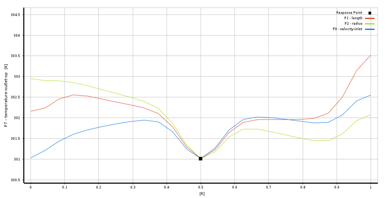
The local sensitivity curve represents the sensitivity of one or two output parameters defined as input parameters or variables; you can determine a constant value for each input parameter in this type of curve; in this curve, you can see the sensitivity of each input parameter to the range of quantitative changes in the output parameter.
If using this curve, the sensitivity of an output parameter measures in terms of a fixed amount of input variables, the vertical axis represents the range of changes in the value of the output parameter, and the colored lines inside the curve represent each One of the input parameters is its constant value, also, the horizontal axis indicates the amount of sensitivity in terms of different values obtained from the desired output parameter.
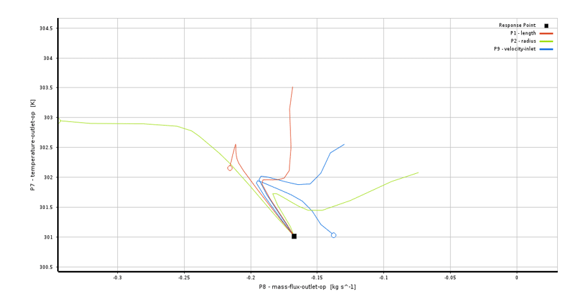
Using this curve, the sensitivity of the two output parameters evaluates in terms of a fixed amount of input variables; both the horizontal and vertical axes represent the range of changes in the value of the two selected output parameters. Furthermore, the colored lines inside the curve represent each input parameter with their constant value; in this case, you can see the simultaneous changes of the two output parameters. That is, their simultaneous sensitivity to input parameters is measured.
Figure 9. Local sensitivity curve of an output parameter
Suppose, in an example, you investigate the changes of an output parameter called the output temperature (temperature-outlet) in terms of the changes of the three input parameters called the length geometry (length), the radius of the geometry (radius), and the velocity-flow inlet (velocity-inlet) using the method Response levels (RSM). Figure 10 shows the local sensitivity curve of the output temperature variable to the parameters of geometric length and radius, and inlet flow velocity; So that the vertical axis represents the changes in the value of the output temperature, and the horizontal axis represents the sensitivity of this parameter and the colored lines for each of the input parameters also includes in the curve.
Figure 10. Local sensitivity curve of two output parameters
Introducing the Spider Diagram
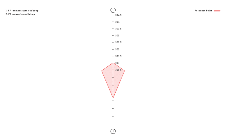
A spider diagram is a visual effect with a spider-like pattern that includes the range of changes of each output parameter. An equivalent axis is generated for each available output parameter that divides that axis from its minimum to maximum value. The colored part produced by integrating these axes includes the space for the response surface.
Suppose that in the example, the changes of the two output parameters as the output temperature (temperature-outlet) and the mass flow output (mass flux-outlet) in terms of the changes of the three input parameters as the length geometry (length), radius geometry (radius) and velocity The flow inlet (velocity-inlet) investigates using the response surface methodology (RSM). Figure 11shows the spider diagram of the output temperature and the output flow rate at a constant value of the input parameters, as you can see from the figure, the two vertical lines represent the segmented interval of each of the output parameters and the color space for the expression of the response points.
Figure 11: Spider diagram for two output parameters


Comments (0)